
Ing. Martin Čavarga.
FMFI UK, Katedra algebry a geometrie, Kancelária: M122
mcavarga@gmail.com, cavarga1@uniba.sk, martin.cavarga@fmph.uniba.sk .
 Všeobecné informácie o predmete nájdete v informačnom liste. Všetky HTML/CSS komponenty sú zrozumiteľne vysvetlené na https://www.w3schools.com .
 General info is available in the in the course description. All HTML/CSS components are explained at https://www.w3schools.com .
Podmienky absolvovania predmetu:
- Výber témy pre vlastnú webstránku.
- Logo, banner a iné unikátne dizajnové prvky webstránky.
- Kompletný web spĺňajúci nasledujúce kritériá:
1) Aspoň 3 rôzne stavy, t.j.: napriklad preklikavatelna navigacia medzi: “Domov“, “Kontakt“, “O Nás/O Mne“.
2) Aspoň jednu zaujímavú alebo užitočnú funkcionalitu nad rámec HTML/CSS ako napr. embednuté WebGL zobrazovanie, uploadovanie súborov, registrácia a login, písanie príspevkov.
3) Rozumná organizácia súborov html, css a vizuálnych dát. - Webstránku potom odporezentovať na cvičení po deadline: 27.11.2023
Requirements for passing the course:
- The choice of topic for Your own website.
- Logo, banner and other unique design elements of the website.
- A complete website satisfying the following conditions:
1) At least 3 distinct states, i.e.: switchable navigation between: “Home“, “Contact“, “About“.
2) At least one interesting or useful functionality beyond the scope of HTML/CSS, for example, embedded WebGL display, file upload, sign-up and sign-in, writing posts.
3) Reasonable organization of html, css files and images. - Present the website in class after deadline: 27.11.2023
Cvičenia 1-5:
Stránka obsahujúca jeden článok <article>, hlavičku <header>, horizontálnu a bočnú navigáciu <nav> oddelenú do tagov <div> s triedami “sidenav” a “main” / The website contains an <article>, <header>, horizontal and side <nav> divided using <div> tag with classes “sidenav” and “main”:

Obsah a funkcionality stránky / Contents and functionality of website:

HTML Template:
<!DOCTYPE html>
<html><!DOCTYPE html>
<html>

<div class="sidenav">
    <a href="#">About</a>
    <a href="#">Services</a>
    <a href="#">Clients</a>
    <a href="#">Contact</a>
</div>

<div class="main">

    <header>
        <img src="Logo.jpg" alt="Logo" width="110"/>
        <hr>
    </header>

    <nav>
        <ul>
            <li><button type="button" href="default.asp">Home</button></li>
            <li><button type="button" href="news.asp">News</button></li>
            <li><button type="button" href="contact.asp">Contact</button></li>
            <li><button type="button" href="about.asp">About</button></li>
        </ul>
    </nav>

    <article>
        <h2>How Many Mesh Vertices are in a Mesh After 4:1 Subdivision?</h2>

    <!-- ... -->

    </article>
</div>
</html>
Stiahnite si text a obrázkové mediá tu. / Download the plain text and media here.
Cvičenie 27.10.2022
Responsive design can be divided into the following categories:
- Relative CSS units
- Media queries
- Flexbox
- Responsive typography
https://www.w3schools.com/howto/howto_css_devices.asp
https://codepen.io/pavan501/pen/pywqmV
https://chrome.google.com/webstore/detail/mobile-simulator-responsi/ckejmhbmlajgoklhgbapkiccekfoccmk
Cvičenie 10.11.2022
https://www.w3schools.com/bootstrap/bootstrap_examples.asp
Responsive single-page demo with Bootstrap:

Cvičenie 18.9.2023
1. Document Parsing:
The browser parses the HTML document from top to bottom. As it parses the document, it begins constructing the Document Object Model (DOM) tree.
2. External Stylesheets:
- If the browser encounters an external stylesheet (e.g.,
<link rel="stylesheet" href="style.css">), it will make a request to fetch the stylesheet. - Rendering is blocked until the external stylesheet is downloaded and processed because styles can affect the visual representation of the document.
3. External Scripts (without async or defer):
- If the browser encounters an external script (e.g.,
http://script.js) without theasyncordeferattributes, parsing is blocked. - The browser will make a request to fetch the script (if it’s not already in the cache).
- Once the script is downloaded, it’s executed immediately, which blocks DOM construction and rendering until the script finishes execution.
- This is why traditionally, scripts were placed just before the
</body>tag to prevent them from blocking rendering of the page.
4. Scripts with async attribute:
- Scripts with the
asyncattribute (e.g.,http://script.js) are fetched in parallel with the parsing of the document. - As soon as the script is downloaded, parsing is paused, and the script is executed.
- After the script execution, parsing of the document continues.
- Multiple async scripts are executed in the order they are downloaded, which might not be the order in the document.
5. Scripts with defer attribute:
- Scripts with the
deferattribute (e.g.,http://script.js) are fetched in parallel with the parsing of the document. - Unlike
async,deferscripts are executed in the order they appear in the document and only after the document has been fully parsed. - They are executed right before the
DOMContentLoadedevent is fired.
6. DOM Construction and Rendering:
- After the document has been parsed and all scripts without
asyncordeferhave been executed, the DOM construction is completed. - Once the DOM is ready, the browser begins the rendering process, constructing the CSS Object Model (CSSOM) from styles and then rendering the page.
7. DOMContentLoaded Event:
- The
DOMContentLoadedevent fires when the HTML document has been fully parsed and the DOM is ready. This event doesn’t wait for stylesheets, images, or subframes to load. - Defer scripts are executed right before this event is fired.
8. Other Resources:
- While the DOM is being constructed, the browser will also make requests for other resources (e.g., images).
- However, the loading of these resources doesn’t block the
DOMContentLoadedevent unless they are referenced in a script that does block the event.
9. Load Event:
- The window’s
loadevent fires when the whole page, including all dependent resources (stylesheets, images, etc.), is fully loaded.
In Summary:
For optimal performance:
- Always use external stylesheets at the top to prevent flash of unstyled content.
- Place scripts at the bottom of your document, or use
asyncordeferto prevent them from blocking rendering. - Understand how scripts are executed to ensure dependencies are managed correctly and interactivity is added as soon as possible.
Cvičenie 25.9.2023

Designing a color palette for websites is fundamental in creating an aesthetically pleasing and effective user interface. Here are several principles to consider:
- Brand Consistency: Ensure that the color palette aligns with the brand’s identity and messaging. This helps in maintaining a consistent brand image across different platforms.
- Contrast: Use contrasting colors to make text and important elements stand out against the background. This is especially important for readability and accessibility.
- Color Harmony: Use harmonious color combinations to create a balanced and visually appealing design. Complementary, analogous, triadic, and tetradic are common color schemes.
- Accessibility: Choose colors with sufficient contrast to be distinguishable by people with color vision deficiencies and consider color-blind safe palettes.
- Emotional Impact: Different colors evoke different emotions and responses. Consider the psychological impact of colors and how they align with the website’s purpose.
- Simplicity: Don’t use too many colors. A simple color palette is often more effective and visually pleasing.
- Versatility: Ensure that the color palette works well across different devices and screen sizes.
- Testing and Feedback: Test the color palette with real users to gather feedback and make necessary adjustments.
- Hierarchy and Focus: Use color to establish visual hierarchy and guide users’ focus towards important elements or actions.
- Background and Foreground Balance: Balance background and foreground colors to ensure that text and key elements are easily distinguishable.
- Trends and Culture: Consider current design trends and cultural connotations of colors, but balance them with timelessness to avoid becoming outdated quickly.
- Scalability: Ensure the palette is scalable for future design changes and expansions.
By considering these principles, you can create a color palette that enhances the user experience, aligns with the brand, and is accessible to a wide audience.
Several websites have effectively used color palettes, enhancing their user interface, brand identity, and overall user experience.
- Spotify:
- Palette: Spotify uses a dark theme with black as the background color, accented by green and white.
- Success Factors: The vibrant green stands out against the black background, highlighting controls and call-to-action buttons. This creates a visually appealing contrast, aiding in navigation and usability. The color scheme aligns with Spotify’s brand identity and is instantly recognizable.
- Airbnb:
- Palette: Airbnb employs a white background with a red accent color and uses black for text.
- Success Factors: The clean, simple palette creates an inviting and comfortable feel. The red accent color is associated with warmth and passion, aligning with the idea of hospitality and adventure. This palette helps in easy navigation and readability.
- Slack:
- Palette: Slack features a unique combination of a white and light gray background with various bright accent colors, such as purple, blue, green, and yellow.
- Success Factors: The diverse yet harmonious color palette helps distinguish different UI elements and functionalities, aiding in usability. The bright colors contribute to the brand’s friendly and approachable image.
- Dropbox:
- Palette: Dropbox uses a minimalist color palette consisting of white, light blue, and dark blue.
- Success Factors: The palette is clean and simple, promoting ease of use and focus on content. The blue tones are associated with trust and reliability, which aligns with Dropbox’s brand image as a secure cloud storage solution.
These examples illustrate how a thoughtful color palette can contribute to a website’s success by enhancing usability, aligning with brand identity, and creating a positive user experience.
In the RGB color model, “high contrast” refers to a significant difference in lightness and darkness between two colors, making them stand out against each other. This contrast is especially important for text readability against backgrounds and distinguishing different UI elements.
To define “high contrast” in the RGB color scheme, consider the following:
- Difference in Lightness and Darkness:
- Analyze the difference in lightness and darkness between two colors. A color’s lightness can be calculated using the formula:
[ L = 0.299R + 0.587G + 0.114B ] - A large difference in lightness between two colors typically results in high contrast.
- Analyze the difference in lightness and darkness between two colors. A color’s lightness can be calculated using the formula:
- Contrast Ratio:
- Calculate the contrast ratio between two colors using their relative luminance:
[ Contrast Ratio = (L1 + 0.05) / (L2 + 0.05) ] - Here, (L1) is the relative luminance of the lighter color, and (L2) is the relative luminance of the darker color. The relative luminance is calculated using the sRGB definitions, which incorporate gamma correction.
- A contrast ratio of at least 4.5:1 is generally considered sufficient for normal text, while a ratio of at least 7:1 is recommended for large text or users with visual impairments.
- Calculate the contrast ratio between two colors using their relative luminance:
- Color Difference and Brightness Difference:
- Evaluate both the color difference and brightness difference between two colors. Color difference can be calculated using the formula:
[ Color Difference = (max(R1, R2) – min(R1, R2)) + (max(G1, G2) – min(G1, G2)) + (max(B1, B2) – min(B1, B2)) ] - Brightness difference can be calculated using the formula:
[ Brightness Difference = (299 * (R1 – R2) + 587 * (G1 – G2) + 114 * (B1 – B2)) / 1000 ] - A high value in both color difference and brightness difference typically indicates high contrast.
- Evaluate both the color difference and brightness difference between two colors. Color difference can be calculated using the formula:
By evaluating these factors, you can determine whether two colors in the RGB color scheme exhibit high contrast, contributing to better readability and user experience.
Defining a unified color palette in css:
:root {
    --primary-color: #ff5733;
    --secondary-color: #333366;
    --background-color: #f0f0f0;
}

body {
    background-color: var(--background-color);
    font-size: 16px;
}

p {
    color: var(--secondary-color);
    font-size: 16px;
    font-weight: bold;
}
Cvičenie 2.10.2023
CSS stands for “Cascading Style Sheets.” The cascade determines the order of priority when multiple styles clash. The order, from lowest to highest priority: browser defaults, external styles, internal styles (in the head), inline styles (in the HTML element). Also, a later rule will override an earlier rule if both have the same specificity.
p {
  color: blue;
}

p {
  color: green;  /* This will override the blue color */
}
Inheritance
Some CSS properties are inherited from the parent element to the child, meaning they’re automatically applied to the child as they are to the parent. For instance, font properties in a <div> will be inherited by a <p> inside that <div>.
Selectors
# is an ID selector. It selects an element based on its id attribute. IDs should be unique within a page.
#myID {
  color: blue;
}
Selector *
The universal selector. It matches any element.
* {
  box-sizing: border-box; /* Common usage to ensure consistent box-sizing */
}
Selector >
The child combinator. It selects all elements that are direct children of a specific element.
div > p {
  color: red; /* Only styles <p> elements that are direct children of a <div> */
}
Selector +
The adjacent sibling combinator. It selects an element that is immediately preceded by a certain element.
h2 + p {
  font-weight: bold; /* Styles a <p> that immediately follows an <h2> */
}
Selector []
The attribute selector. It selects elements with a certain attribute and value.
input[type="text"] {
  border: 1px solid gray; /* Styles only text input fields */
}
CSS Classes
A CSS class is a selector that allows you to style multiple elements in the same way. It begins with a dot (.) followed by the class name.
.myClass {
  color: red;
}
Multiclasses
An HTML element can have multiple classes assigned to it, separated by spaces.
<div class="class1 class2">This div has two classes.</div>
Pseudo-Elements and Pseudo-Classes
Pseudo-elements: Allow you to style specific parts of an element. For example, ::before and ::after can insert content before or after an element’s content.
p::before {
  content: "Read: ";
}
Pseudo-classes: They define a special state of an element. For instance, :hover applies styles when the mouse is over an element.
a:hover {
  color: green;
}
Context declaration
It’s a way to style an element based on its context or its parent element.
p em {
  color: red; /* This will style only the <em> elements inside a <p> element */
}
CSS Specificity
Specificity determines which CSS rule will be applied by the browsers, especially when there are multiple conflicting rules targeting the same element.
How does it work? Specificity is calculated based on the different kinds of selectors in a given rule. The specificity can be thought of as a set of four numbers: a-b-c-d.
a: Number of inline stylesb: Number of ID selectorsc: Number of class, attribute, and pseudo-class selectorsd: Number of type (or tag) and pseudo-element selectors
The rule with the higher specificity value is applied. If two rules have the same specificity, the one that appears last in the stylesheet is applied.
Importance: Understanding specificity helps in debugging CSS issues and avoiding the excessive use of !important, which overrides specificity but can make stylesheets hard to manage and maintain.
Block-level vs. Inline-level Elements
Block-level Elements:
- These create a new “block” or “box” in the layout and, by default, take up the full width of their container.
- Examples include:
<div>,<h1>...<h6>,<p>,<ul>,<li>,<section>, and more. - They always start on a new line in the document flow and stack vertically.
Inline-level Elements:
- These flow within the content and take up only as much width as necessary, without breaking onto a new line.
- Examples include:
<a>,<span>,<img>,<strong>,<em>, and more. - They appear on the same line as the content or elements around them, unless they are styled differently (e.g., using
display: block).
Context in HTML & CSS: Understanding the difference is crucial for page layout. You might use block-level elements to create the main structure of a page (like a sidebar, main content area, or footer) and inline-level elements within those blocks for text and other content.
display Rule in CSS
The display property is one of the most fundamental properties in CSS, and it determines how an element is presented in relation to the layout and other elements. Here are some common values for the display property:
block: As discussed, block-level elements take up the full width of their parent container and start on a new line. When an element’s display property is set to block, it will behave this way.
span {
  display: block;
}
In this example, although a <span> is naturally an inline element, it will behave like a block-level element.
inline: Inline elements will not start on a new line and will take up only as much width as necessary.
div {
  display: inline;
}
With the above rule, even though a <div> is naturally a block-level element, it will now behave like an inline element.
inline-block: This is a mix of both inline and block. The element will be inline, but it will retain block-like features, like being able to set width and height.
span {
  display: inline-block;
  width: 100px;
  height: 100px;
}
none: The element will not be displayed, and it will not take up any space in the layout, as if it’s not present in the DOM. This is different from visibility: hidden, which hides the element but still takes up space.
div {
  display: none;
}
Other Values: With the evolution of CSS, there are now more advanced display values like flex (for flexible box layouts), grid (for grid layouts), and table (to display elements as table elements), among others.
Relation to the Box Model:
The CSS box model is a rectangular layout paradigm, which is a fundamental concept in CSS. Every element is represented as a rectangular box, and this box has a series of properties that define its presentation and layout:
- Content: The actual content of the box, where text and images appear.
- Padding: The space between the content and the border.
- Border: The boundary of the box.
- Margin: The space outside the border.
The display property directly affects the box model:
- For
blockelements, the width defaults to 100% of the parent container (unless specified otherwise), and the height is based on the content. Margins, borders, and padding will then affect its total size and position. - For
inlineelements, width and height properties won’t apply. They will take the width of their content. Only left and right margins/paddings are considered; top and bottom aren’t. - For
inline-blockelements, they are treated as inline elements, but they maintain block-level styling capabilities. So, you can set width, height, padding, margins, and borders like you would on a block-level element.
Understanding the display property in conjunction with the box model is critical for effective CSS layout and design because it lets you control how space is consumed and how elements are positioned relative to one another.

Example:
<!DOCTYPE html>
<html lang="en">
<head>
    <meta charset="UTF-8">
    <meta name="viewport" content="width=device-width, initial-scale=1.0">
    <title>Box Model Example</title>
    <link rel="stylesheet" href="StyleSheet1.css">
</head>
<body>
    <div class="box">
        This is the content of the div. It's surrounded by padding, which is then surrounded by a border, and finally, there's a margin around the border.
        <p class="specialp">This is another element.</p>
    </div>
    <div class="bluebox">
        This is the content of the div. It's surrounded by padding, which is then surrounded by a border, and finally, there's a margin around the border.
        <p class="specialp">This is another element.</p>
    </div>
</body>
</html>
body {
    font-family: Arial, sans-serif;
    display: flex;
    justify-content: center;
    align-items: center;
    height: 100vh;
    background-color: #f5f5f5;
    flex-direction: column; /* Ensure child elements stack vertically */
}

.box {
    display: block;
    background-color: #e9e9e9; /* content background color */
    padding: 30px; /* space between content and border */
    border: 10px solid #333; /* border around the content + padding */
    margin: 50px; /* space around the border */
    color: red;
}

.bluebox {
    display: block;
    background-color: #edf0f2; /* content background color */
    padding: 30px; /* space between content and border */
    border: 10px solid #0394fc; /* border around the content + padding */
    margin: 50px; /* space around the border */
    color: red;
}

.specialp {
    color: blue;
    font-weight: bold;
}

.specialp:hover {
    color: green;
}

.bluebox .specialp:hover {
    color: red;
}
Cvičenie 16.10.2023
Responsive Design
Designing web pages that work well on a variety of devices and window/screen sizes.
- Importance: Accessible to a wide range of users, SEO benefits, and enhanced user experience.
- Key Concepts:
- Fluid Grids: Using relative units like percentages instead of fixed units.
- Media Queries: Applying CSS only when certain conditions (e.g., min-width) are met.
- Flexible Images: Ensure images are scalable and do not exceed their containing elements.
HTML Canvas
An HTML element used to draw graphics on a web page via scripting (typically JavaScript).
- Use Cases: Graphs, game graphics, art, and other visual images.
- Key Concepts:
- Drawing Shapes: Rectangles, circles, and other basic shapes.
- Applying Styles and Colors: Strokes, fills, and gradients.
- Drawing Text: Rendering text on the canvas.
CSS Animations
A way to make changes to the properties of an element and control the timing of those changes.
- Importance: Enhance user experience, provide visual feedback, and guide attention.
- Key Concepts:
- Keyframes: Define the stages and styles of the animation.
- Animation Properties: Such as
duration,timing-function, anddelay. - Transitions: Smoother changes from one style configuration to another.
Example:
index.html
<!DOCTYPE html>
<html lang="en">
<head>
    <meta charset="UTF-8">
    <meta name="viewport" content="width=device-width, initial-scale=1.0">
    <link rel="stylesheet" href="style.css">
    <title>Web Graphics Example</title>
</head>
<body>
    <header>
        <h1>Web Graphics Example</h1>
    </header>
    <main>
        <canvas id="myCanvas" width="200" height="200"></canvas>
        <p id="responsiveText">Resize me!</p>
    </main>
</body>
<script src="script.js"></script>
</html>
styles.css
body {
    font-family: Arial, sans-serif;
    margin: 0;
    padding: 0;
    display: flex;
    flex-direction: column;
    align-items: center;
}

header {
    background-color: #4CAF50;
    color: white;
    padding: 15px;
    width: 100%;
    text-align: center;
}

main {
    margin: 20px;
    text-align: center;
}

#responsiveText {
    font-size: 18px;
    transition: font-size 0.5s ease-in-out;
}

/* Responsive design for text */
@media only screen and (max-width: 600px) {
    #responsiveText {
        font-size: 14px;
    }
}

/* CSS Animation: Change color on hover */
header:hover {
    background-color: #45a049;
    transition: background-color 0.5s ease-in-out;
}
script.js
document.addEventListener("DOMContentLoaded", () => {
    let canvas = document.getElementById("myCanvas");
    let ctx = canvas.getContext("2d");
    let radius = 50; // Initial radius of the circle

    const drawCircle = (radius) => {
        // Clear the canvas
        ctx.clearRect(0, 0, canvas.width, canvas.height);

        // Draw a circle
        ctx.beginPath();
        ctx.arc(100, 100, radius, 0, 2 * Math.PI);
        ctx.fillStyle = "#FF0000";
        ctx.fill();
        ctx.closePath();

        // Draw text
        ctx.font = "20px Arial";
        ctx.fillStyle = "#000000";
        ctx.fillText("Hello!", 70, 50);
    };

    // Draw initial circle
    drawCircle(radius);

    // Event listener for mousemove
    window.addEventListener("mousemove", (e) => {
        // Update radius based on mouse's x-position
        radius = e.clientX / 10;
        drawCircle(radius);
    });
});
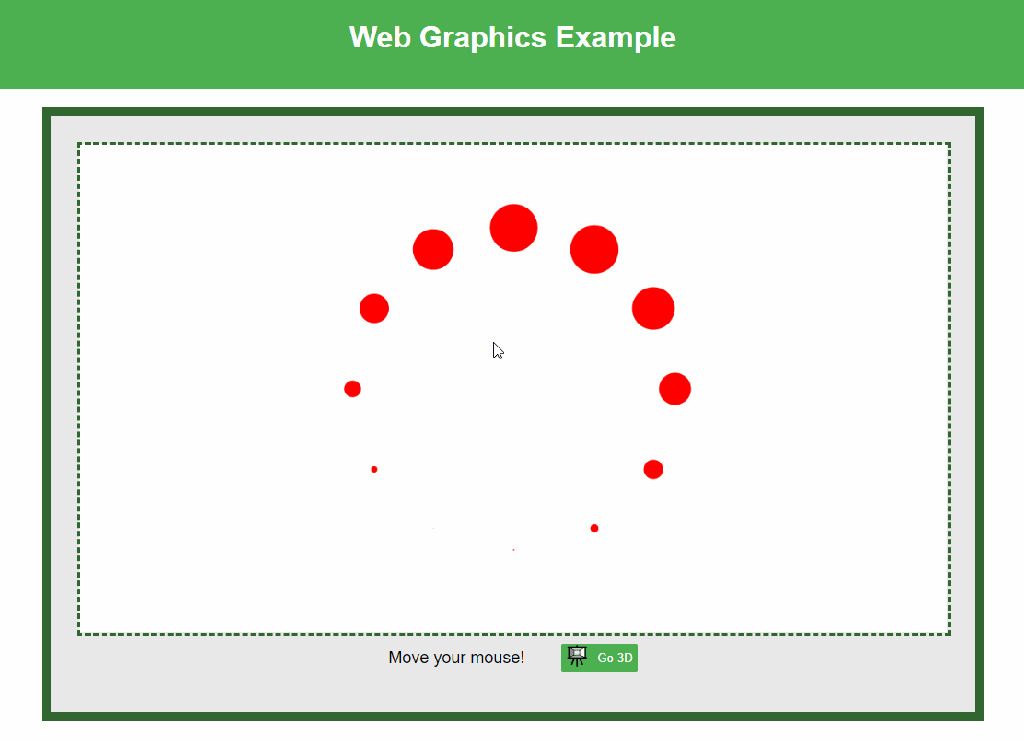
TODO: Create The Following Animation:

Cvičenie 23.10.2023
Introduction to JavaScript
- JavaScript is a high-level, interpreted programming language.
- Conceived in 1995 by Brendan Eich at Netscape.
- Became the scripting language of the web, allowing for interactive websites.
Evolution of JavaScript: ES5 vs. ES6
- ES5 (ECMAScript 5) – 2009:
- The “vanilla” JavaScript that many came to know.
- Introduced strict mode, JSON support, and Array methods like
forEach,map,filter.
- ES6 (ECMAScript 2015 or ES2015):
- A major update to the language.
- Introduced:
let&constfor block-scoped variables.- Arrow functions (
() => {}). - Template literals (
${}). - Classes.
- Promises for asynchronous programming.
- Destructuring.
- Default, rest, and spread.
- Modules (import/export).
JavaScript Modules
- What are Modules?:
- Way to split a JavaScript program into smaller, reusable pieces.
- Can export parts of a module to make them available for import in other modules.
- Benefits:
- Maintainability: Organize code in a modular fashion.
- Namespace: Avoid variable name collisions by keeping code isolated in modules.
- Reusability: Write once, use in many applications.
- Lazy Loading: Load parts of an application on demand.
Why Modules Can’t be Loaded from Local Directories
- Security Concerns:
- The primary reason is security. Directly loading modules from local file paths can open the door to “cross-origin” attacks, where malicious scripts can access sensitive files.
- To prevent these potential security breaches, web browsers have a security feature called the Same-Origin Policy (SOP).
- An origin is defined by the combination of scheme (protocol), domain (hostname), and port.For instance,
https://www.example.com:443andhttp://www.example.com:80are two different origins because they use different protocols and ports. - Under the Same-Origin Policy, a web page from one origin is prohibited from accessing data (like DOM elements or cookies) from a different origin without explicit permission.
- while the Same-Origin Policy’s primary purpose is to protect web content, its principles also extend to local files to prevent possible malicious activities. For local web development, always consider serving your content through a local server rather than accessing files directly using the
file:///scheme.
- CORS (Cross-Origin Resource Sharing):
- CORS allows web pages to request resources from different origins (domains, protocols, or ports) securely.
- Local files don’t have an origin per se, so the browser treats them as different origins.
- Development Environment:
- For development, the recommendation is to use local servers or tools like Webpack, Parcel, or the Live Server extension in Visual Studio Code. These create a local server environment that can handle module requests appropriately.
Download: WEGACv5_StudentVersion.zip
Adding a canvas with an elementary 3D scene with Three.js:
index.html:
<!DOCTYPE html>
<html lang="en">
<head>
    <meta charset="UTF-8">
    <meta name="viewport" content="width=device-width, initial-scale=1.0">
    <link rel="stylesheet" href="styles.css">
    <title>Web Graphics Example</title>
    <script src="https://cdnjs.cloudflare.com/ajax/libs/three.js/r128/three.min.js"></script>
    <script src="https://threejsfundamentals.org/threejs/resources/threejs/r115/examples/js/controls/OrbitControls.js"></script>
</head>
<body>
    <header>
        <h1>Web Graphics Example</h1>
    </header>
    <main>
        <div class="canvas-wrapper">
            <canvas id="myCanvas2D"></canvas><script src="scene2D.js"></script>
            <canvas id="myCanvas3D" style="display: none;"></canvas><script src="scene3D.js"></script>
        </div>
        <div class="canvas-utils">
            <p id="responsiveText">Move your mouse!</p>

            <button id="go3DButton">
                <span class="icon">
                    <object id="svgIcon" type="image/svg+xml" data="3DCanvas.svg" width="24" height="24">
                        <!-- Fallback content for browsers that don't support SVG -->
                        Your browser does not support SVG
                    </object>
                </span>
                <span id="buttonText">Go 3D</span>
            </button>
        </div>
    </main><script src="canvasControls.js"></script>
</body>

</html>
scene3D.js:
document.addEventListener("DOMContentLoaded", () => {
    let canvas = document.getElementById("myCanvas3D");
    let context = canvas.getContext("webgl2", { alpha: false });

    let scene, camera, renderer, icosahedron, controls;

    function initScene3D() {
        // Create the scene
        scene = new THREE.Scene();

        // Create the camera
        camera = new THREE.PerspectiveCamera(40, canvas.width / canvas.height , 0.01, 1000);
        camera.position.z = 5; // Position the camera

        // Create the renderer
        renderer = new THREE.WebGLRenderer({ canvas: canvas, context: context, antialias: true });

        // Set the renderer's background color
        const canvasWrapper = document.querySelector(".canvas-wrapper");
        const computedStyle = getComputedStyle(canvasWrapper);
        renderer.setClearColor(computedStyle.backgroundColor);

        // Create the icosahedron geometry and mesh
        const geometry = new THREE.IcosahedronGeometry(1.2);
        const material = new THREE.MeshBasicMaterial({ color: 0x326630, wireframe: true });
        icosahedron = new THREE.Mesh(geometry, material);
        scene.add(icosahedron);

        // Add orbit controls
        controls = new THREE.OrbitControls(camera, renderer.domElement);
        animateScene3D();
    }

    function animateScene3D() {
        requestAnimationFrame(animateScene3D);
        icosahedron.rotation.x += 0.01;
        icosahedron.rotation.y += 0.01;
        renderer.render(scene, camera);
    }

    canvas.addEventListener("resize", function() {
        const newWidth = canvas.width;
        const newHeight = canvas.height;

        camera.aspect = newWidth / newHeight;
        camera.updateProjectionMatrix();

        renderer.setSize(newWidth, newHeight);
    });

    initScene3D();
});
canvasControls.js:
const btn = document.getElementById("go3DButton");
const canvas2D = document.getElementById("myCanvas2D");
const canvas3D = document.getElementById("myCanvas3D");
const svgIcon = document.getElementById("svgIcon");
const btnText = document.getElementById("buttonText");
let canvasWrapper = document.querySelector(".canvas-wrapper");

resizeCanvasAccordingToWrapper(canvas2D, canvasWrapper);
resizeCanvasAccordingToWrapper(canvas3D, canvasWrapper);

btn.addEventListener("click", function() {

    // When you prepend the icon element using btn.prepend(document.querySelector('.icon'));,
    // you're re-inserting the .icon into the DOM. However, the SVG inside the <object> tag might not
    // reload or render properly after being moved in the DOM.

    if (canvas2D.style.display === "none") {
        // Switch to 2D
        canvas3D.style.display = "none";
        canvas2D.style.display = "block";

        // Update the button text
        btnText.textContent = "Go 3D";

        // Switch the SVG icon to 3D view
        svgIcon.setAttribute("data", "3DCanvas.svg");
    } else {
        // Switch to 3D
        canvas2D.style.display = "none";
        canvas3D.style.display = "block";

        // Update the button text
        btnText.textContent = "Go 2D";

        // Switch the SVG icon to 2D view
        svgIcon.setAttribute("data", "2DCanvas.svg");

        initScene3D();
    }

    // You can also initialize or refresh your canvas rendering here, if needed.
});

// Because canvas is responsive to canvas-wrapper size, we need to resize the canvas
function resizeCanvasAccordingToWrapper(canvas, canvasWrapper) {
    canvas.width = canvasWrapper.offsetWidth;
    canvas.height = canvasWrapper.offsetHeight;
}

canvasWrapper.addEventListener("resize", function() {
    resizeCanvasAccordingToWrapper(canvas2D, canvasWrapper);
    resizeCanvasAccordingToWrapper(canvas3D, canvasWrapper);
});
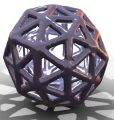
TODO: Implement the following Mouse-Controlled 3D Geometry:
Cvičenie 6.11.2023
Node-Packaged Website Project
https://careerfoundry.com/en/blog/web-development/what-is-npm/
Step 1: Set Up Node.js and npm
Make sure you have Node.js and npm installed. You can download them from nodejs.org. The npm comes bundled with Node.js.
Step 2: Initialize Your Project
Open your terminal or command prompt, navigate to the root directory of your project, and run the following command:
npm init -y
This will create a package.json file with default values.
Step 3: Install Dependencies
Now, you should install any dependencies you have as npm packages. For example, if you’re using three.js, dat.gui, and orbit controls, you could install them like this:
npm install three dat.gui
Step 4: Re-organize Your Project Files
After installing your packages, your project structure will look something like this:
/your-project
  /node_modules
  /src
    - index.html
    - styles.css
    - scene2D.js
    - scene3D.js
    - canvasControls.js
  package.json
  package-lock.json
Step 5: Modify Your HTML and JavaScript Files
Adjusting HTML File
Change the script and link tags in your HTML to point to the local versions you’ve installed via npm, or you could bundle them using a bundler like Webpack or Parcel.
Adjusting JavaScript Files
Instead of referencing scripts from CDN, you will now import them in your JavaScript files. For example:
import * as THREE from 'three';
import { OrbitControls } from 'three/examples/jsm/controls/OrbitControls.js';
import GUI from 'dat.gui';
And then use these imports in your scripts instead of relying on globals.
Step 6: Use a Bundler (Optional but Recommended)
To bundle your modules together, you may want to use a module bundler like Webpack, Parcel, or Rollup. For example, if you choose Parcel, which requires zero configuration for simple projects, install it globally:
npm install -g parcel-bundler
Then you can build your project and run a development server with:
parcel src/index.html
Step 7: Update Scripts in package.json
You might want to add some scripts to your package.json to make running your project easier. For instance, using Parcel, you might add:
"scripts": {
  "start": "parcel src/index.html",
  "build": "parcel build src/index.html"
}
You can then start your project with npm start and build it for production with npm run build.
Step 8: Run Your Project
Finally, run your project using the npm start script:
npm start
Your site should now be running on a local server, typically found at http://localhost:1234 unless you configure it otherwise.
This is a basic guide, and depending on the complexity and requirements of your project, additional steps may be necessary. Consider reading more about npm, Webpack, Parcel, and modern JavaScript development workflows for more in-depth knowledge.
Clone a working repo at: https://github.com/MCInversion/WEGA/tree/main
TypeScript Project Setup

Step 1: Install Node.js and npm
- Ensure you have Node.js and npm installed. If not, download and install them from the official Node.js website.
Step 2: Initialize a new npm project
(only if you’re not re-visiting an existing one)
npm init -y
Step 3: Install TypeScript and Parcel
- Install TypeScript and Parcel as development dependencies in your project:
npm install --save-dev typescript parcel-bundler
Step 4: Initialize TypeScript Configuration
- Although Parcel handles most configurations automatically, you can still initialize a
tsconfig.jsonif you need custom TypeScript configurations:
npx tsc --init
Step 5: Create Your Files
src/index.html:
<!DOCTYPE html>
<html lang="en">
<head>
    <meta charset="UTF-8">
    <meta name="viewport" content="width=device-width, initial-scale=1.0">
    <title>Counter Example</title>
    <link rel="stylesheet" href="style.css">
</head>
<body>
    <div class="container">
        <h1>Simple Counter</h1>
        <div id="counter-value">0</div>
        <button id="increment-btn">Increment</button>
    </div>
    <script src="script.ts"></script>
</body>
</html>
src/style.css:
body {
    font-family: Arial, sans-serif;
    display: flex;
    justify-content: center;
    align-items: center;
    height: 100vh;
    margin: 0;
}

.container {
    text-align: center;
}

#counter-value {
    font-size: 2em;
    margin: 20px;
}

button {
    padding: 10px 20px;
    font-size: 1em;
    cursor: pointer;
}
src/script.ts:
window.onload = () => {
    let counter = 0;
    const counterElement = document.getElementById('counter-value') as HTMLElement;
    const button = document.getElementById('increment-btn') as HTMLButtonElement;

    button.addEventListener('click', () => {
        counter++;
        counterElement.innerText = counter.toString();
    });
};
Step 6: Add Start Script in package.json
- Modify your
package.jsonto add a start script that uses Parcel:
"scripts": {
  "start": "parcel index.html",
  "build": "parcel build index.html"
}
Step 7: Use Parcel to run the project site
parcel src/index.html
and run the site at http://localhost:1234 (unless set otherwise).
A Svelte.js Example:

Step 1: Setting Up the Project
- Install Node.js: Ensure you have Node.js installed on your machine. You can download it from nodejs.org.
- Create a New Svelte Project: You can create a new Svelte project using
degit, a scaffolding tool. First, installdegitif you haven’t already:
npm install -g degit
Then create a new Svelte project:
npx degit sveltejs/template svelte-basic-example
cd svelte-basic-example
3. Install Dependencies: Once you’ve created the project, navigate into the project directory and install its dependencies:
npm install
Start the Development Server: Run the development server:
npm run dev
This will start the server, usually on http://localhost:5000.
Step 2: Creating a Basic Svelte Component
In your Svelte project, you will have a file called App.svelte. This is the main component of your application. Let’s create a simple counter component in it.
Replace the content of App.svelte with the following:
<script>
    // Script section for JavaScript logic

    // A reactive variable to keep track of the count
    let count = 0;

    // A function that increments the count
    function increment() {
        count += 1;
    }
</script>

<!-- HTML template section -->
<main>
    <!-- Title of the counter -->
    <h1>Simple Counter</h1>

    <!-- Button that calls the increment function on click -->
    <!-- The 'class="animate"' is used for applying the click animation -->
    <button on:click={increment} class="animate">
        Click me
    </button>

    <!-- Displaying the current count -->
    <p>You've clicked the button {count} times.</p>
</main>

<!-- Style section -->
<style>
    /* Keyframes for the click animation */
    @keyframes clickAnimation {
        0% { transform: scale(1); }
        50% { transform: scale(0.8); }
        100% { transform: scale(1); }
    }

    /* Styling for the main container */
    main {
        text-align: center;
        padding: 2em;
        margin: auto;
        max-width: 300px;
        border: 10px solid #0077b6; /* Ocean Blue Border */
        border-radius: 15px;
        box-shadow: 0px 0px 15px rgba(0, 119, 182, 0.2);
    }

    /* Styling for the button */
    button {
        margin: 1em;
        padding: 0.5em 1em;
        background-color: #0077b6; /* Ocean Blue background */
        color: white; /* White text color */
        border: none;
        border-radius: 5px;
        cursor: pointer;
        transition: background-color 0.3s; /* Transition for hover effect */
    }

    /* Hover effect for the button */
    button:hover {
        background-color: #005f8c; /* Darker shade of blue on hover */
    }

    /* Applying the click animation when the button is active (being clicked) */
    button.animate:active {
        animation: clickAnimation 0.3s ease;
    }

    /* Styling for the paragraph displaying the count */
    p {
        color: #333; /* Dark text color for readability */
    }
</style>
 Martin Cavarga